

Section 9: Step-by-Step Guide to Data Analysis & Presentation
Try it—You Won't Believe How Easy It Can Be (With a Little Effort)
Part B: Presentation
How to Make Graphs in PowerPoint
In Section 7, we talked about making tables and graphs to present your data. Here, we will present step-by-step instructions and templates for making two types of graphs—a line graph and a bar chart. We will use PowerPoint, though these charts are importable into Word and can also be made in Excel. We don’t recommend making them in SPSS, though you certainly could. Graphs exported from SPSS do not look as good.
Let’s take evaluation question we posed for Question 3; then use the tables we generated to make appropriate graphs to illustrate our outcomes.
Question 3: How did ELL/FEP and EP students score on the CST English Language Arts test in 2004-05?
As a reminder, this was the output we obtained when we ran the SPSS Crosstabs for each grade level. We'll name it Table Q3 so we can refer back to it.
Table Q3

To make a graph of this information, in Section 7 we learned that frequency counts best lend themselves to a bar chart. In PowerPoint, we can insert a bar graph by doing the following [PC users: your instructions will be in brackets if they differ from instructions for Mac]:
1. Open PowerPoint (this assumes you have it installed on your computer). [If you haven't opened it before and have a list of options, click on Blank, which is the default.]
2. Click on New Presentation [PC users: your slide may already be there so don't click].
3. Now you will have the title page. Where it says Click to add title, click there and add any title you want (e.g., Student Data for 2006-07). Where it says Click to add subtitle, you could put your school name and the current date (we are putting Toolkit Example and August 2006 for the date).
4. In the Toolbar, go to File and then Save as. Give it a name that's helpful to you that describes the data and year. (Be sure that you save it in the folder you saved your other files or on the desktop). We're naming our file examp03-04gr34. Notice that when we save it, a .ppt extension is added to it. That's what will tell PowerPoint that this is a PowerPoint file.
5. Now we have one slide in our presentation. Don't worry about the backgrounds and layout and all that for now.
6. Go to the Toolbar, and click Insert, then New Slide. Now you have a new slide that looks different than the first page. Go to the Toolbar, click on Format, then Slide Layout. [Note: on the PC, you'll see the slide layout on the right side—it looks a little different than below, but it's the same set of options.] Now you'll see:
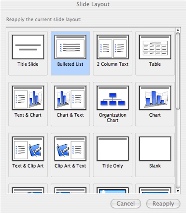
7. We want to show a chart and make some comments, so we’ll click on Text & Chart. [PC users: go down to Text and Content Layouts—select the first slide layout, called text, title, content].
8. Now you should see an icon in the large rectangle on the right-hand side of the slide. Mac users: double click on it, like the instructions say. [PC users: double click on the tiny chart icon within the rectangle of icons.] Now, without having to do anything you have a bar chart that looks like the following:
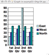
9. Of course, this bar chart doesn’t represent your data, so we’ll have to input the data from our SPSS table.
10. Notice that there is also a table that looks like the following: [PC users: you might have to double click on the chart to see the table, but then the table looks the same as below.]
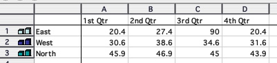
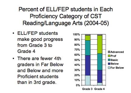
11. We’re going to restrict this chart to the ELL/FEP students and make one column for 3rd graders and one column for 4th graders.
12. Click on the box in the table on the top row that says 1st Qtr and type in: Grade 3, then replace 2nd Qtr with Grade 4. Now, click on C and, keeping the mouse button depressed/clicked, move the cursor over to D. Now columns C and D will be highlighted, so hit the Delete key and those columns will disappear. An easy way to get rid of the data in this spreadsheet that you don’t want is to click on the first box that has 20.4, hold the mouse key down while you scroll down to the other 2 boxes below it. Then hit delete. You can do that across the columns as well by moving the mouse to the right. You just have to remember to keep the mouse clicked while you do this.
13. Next go to the box in the leftmost column where it says East and type in Far Below, then go down a row and type in Below where it says West, then Basic where it says North, then Proficient, and then Advanced.
14. OK, now we’re going to enter the data from Table Q3, but which data do we enter? Numbers? Percentages? Which percentages? Percentages are more helpful than numbers in most of these charts. Since we are focusing on the ELL/FEP students, we are looking down the column. So, locate the 100% at the bottom, where it says Total – Count is 41%, within CST ELA is 69.5%, and % within Lang is 100%. We will follow that 100% (note it is the third row of numbers in each column) up the column to make sure we are using the right percentages.
15. So, we’re going to enter the data for the 3rd graders first. If we look at Table Q3 for ELL/FEP, we see that 19.5% of the students were Far Below. You can either enter 19.5 (leave off the %), or you can round to 20. Then enter 39, 29.3 (or 29), 9.8 (or 10), 2.4 (or 2). Now you have the first column finished.
16. On Table Q3, look at the Grade 4 column for Far Below. Locate the information for fourth graders, the column for ELL/FEP, then the 100% at the bottom of the table. It’s the third number in the box, so that’s the percentage you want. So, enter 5 for Far Below, then 25 for Below Basic, then 32.5 (or 33), then 35, then 2.5 (or 3).
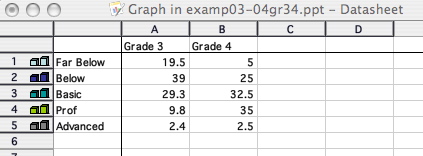
17. Now all your data is entered. It should look like the following:
18. Mac users: Go to the Toolbar; you'll see that it says Graph, not PowerPoint. That's because you're making a Graph, and there's a Graph program built into PowerPoint. It's the same one that's built into Word by the way (That means you can use the same procedures to make a Graph in Word or you can copy your chart from PowerPoint to Word and from Word to PowerPoint). So, click on graph, then down to Quit & return to examp03-04gr34 (or whatever you named your file). Now, you'll see the following graph.
PC users: just click outside the chart area (anywhere on the large left rectangle that says Click to add text.) You'll also see the graph below.
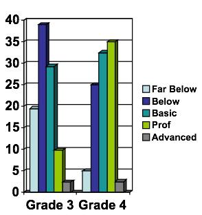
19. This is not as helpful a graph as we might hope for. That’s because it’s a little difficult to tell how well students are really doing. You have to figure out which bar represents which proficiency level, and it’s not intuitively obvious what these findings suggest. So, let's change this graph.
Go back and double click on the graph. Now you’ll be in the Graph program again. Now go to the Toolbar and click on Chart, and then Chart Type. You’ll see the following:
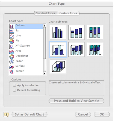
20. These are all the types of charts you can make with PowerPoint. You'll note that, in their terminology, we are making a Column chart and not a Bar chart. Now, click on the third chart on the top line under Chart sub-type (click OK or enter if you need to). This will give us a chart that adds up to 100%. Since we have percentages that add up to 100%, this would be the most helpful way to display these data.
21. Look at what happened to your chart. Mac users: go back up to the Toolbar, and click on graph then down to Quit and return to examp03-04gr34 (or your file). PC users: click on the left of your chart (where it says Click to add text).
22. Now, you can see the following chart.
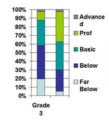
This chart is a lot easier to interpret than the previous chart. We can readily see the percentage of students in each category. However, we need to clean this up a bit because on closer examination, the Advanced and Far Below labels are on 2 lines and the Grade 4 label seems to have disappeared, though the data are there. This is an easy problem to correct; it means the font is too big for the space.
So, double click on your chart again. Now, click close to the lower left bottom edge of the chart and you should see it say Chart Area. Go to the Toolbar to Format and scroll down to Selected Chart Area (if you don’t see it that means you didn’t actually select the Chart area so try it again—put your cursor about ½” above the bottom left corner of the rectangle and then go back to the Toolbar). Now, click on font and you’ll see you can select whatever size font, font style and size you want. For now, just select 16 for size.
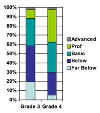
Now your chart looks like the one below. Mac users: go back up to the Toolbar, and click on graph then down to Quit and return to examp03-04gr34 (or your file). PC users: click on the left of your chart (where it says Click to add text). You’re done—with the chart anyway!
23. Click in the left box of the PowerPoint slide and add some text that explains what we see in the chart.
24. We also want to add a title—one that tells us which group, the outcome variable we are looking at (Reading/Language Arts), and some indication of the date.
25. Go to File and Save.
Finally, we have our second slide that looks like the following:
We’re not going to get into all the details about formatting and making slides look pretty or changing colors on the bars (while you’re in the chart, just double click on the color you want to change, then select the color). You can consult the PowerPoint manual or the tutorials presented earlier in this section.
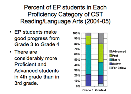
HINT. If you were going to make another chart that presented the information for the EP students, you could copy this chart and then update it with the EP data. Let’s see how that is done.
1. From the second slide that you just made, go to the Toolbar, Insert, Duplicate slide and presto, you’ve got another slide that looks just like the last one.
2. Now, on the little arrows to the right and bottom of the slide, click on the down arrow and it will take you to the new—duplicate—slide. When you do this make sure that you are making changes on the duplicate and not the original.
3. Now, double click on the graph and repeat the steps above, but putting in data for the EP students, changing the title for EP, then changing the description so it is appropriate for EP students. Our revision of the chart would look something like the following:
Now, let’s take a different evaluation question that requires a line graph and looks at growth over time.
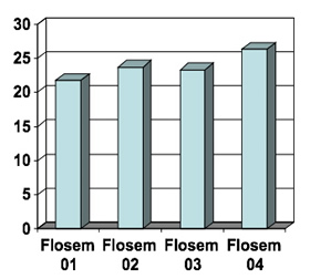
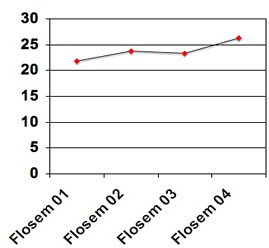
Question 6: What progress do current 4th-grade Spanish speakers show in English proficiency as measured by the FLOSEM during their participation in the program?
As a reminder, this was the output we obtained when we ran the SPSS Crosstabs for each grade level.

1. First, go to the Toolbar and click on Insert, then New Slide. Then you have another slide to which you can add data. Note that it's in the same format as our previous slide. (If it's not in the same format, go to Format, then Slide Layout like we did in step #6 in Question 3 above)
2. Double click on the graph icon like we did before in step #8 and you'll see the same data and chart as we saw before. It's their default chart and table. So, we'll need to change that. So, replace 1st Qtr with Flosem 01, 2nd Qtr with Flosem 02, 3rd Qtr with Flosem 03, and 4th Qtr with Flosem 04.
3. Next, replace East with Span 4th and enter the means associated with each year: 21.8, 23.7, 23.3, 26.3. Remember to put these in the correct order (Flosem 01 is on the bottom of the table and Flosem 04 is on the top).
4. Now click on the leftmost column in the 2nd row that's labeled 2 (with 2 navy blue bars/boxes) associated with West, keep the mouse depressed/clicked and go down to row 3 (North). Now rows 2 and 3 should be highlighted, so hit the Delete key and they'll disappear. Then get rid of the remaining values like we did in step #12 above.
5. Now you have a graph that looks something like one of the following (don't worry if yours doesn't look exactly like one below, as the formatting sometimes differs from one version of PowerPoint to another—our chart will change when we convert it to a line graph and make additional changes. If you want to get rid of the legend, we'll mention how to do that in a minute. If you want to make all your value labels [Flosem 01, Flosem 02, etc.] appear on the chart to the right, follow the directions in step 22 above or keep reading).
We said we were going to make a line chart, and this isn’t it yet. By the way, if you want to change the Y-axis so that it focuses on a smaller range to note the growth over time (e.g., from 20 to 30), you can do that. You simply put the cursor on the left (Y) axis and double click. You should see a box that comes up that says Format Axis. Click on Scale (second box in the row at the top), and then type in whatever value you want as your lowest value (in the example, it is 0) where it says Minimum, and the highest value you want (in the example, it is 30) where it says Maximum. You may set whatever unit you want for the axis (in the example, it is 5) where it says Major unit; then click OK.
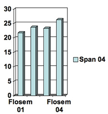
6. We will now convert this chart to a line graph. Go to the Toolbar and click on Chart, then Chart Types, then click on Line (third option down), and then OK. Now you see a line chart that looks like this:
Upon closer inspection, your chart is suffering from too large a font for the space it has. You can widen the chart by single clicking on the chart. You’ll notice some tiny squares surrounding the chart. Click on the left middle square and drag it left. You can click on the right middle square and drag it right too. [Be sure to stay on the page.] Now, if you drag too far to the left, you’ll end up in the text space when you get back to your PowerPoint page (remember that you want some text on that page). But the text space doesn’t mind being squished a little. You can slim it down a little by clicking within the Click to add text box, and dragging the little square on the right middle over to the left a bit.
When you drag and expand on graphs, you can make them look funny, though, so it’s a good idea to try to do it equally on left/front and top/bottom. You can do this by moving the top left square or the bottom right square. Notice it increases or decreases size both vertically and horizontally. (If you are confused with these instructions, just experiment a little or watch the PowerPoint tutorial referenced above—doing some experimenting will help you figure out how to use it.)
To get more left/right space, you can also move your legend. Click on the legend (where it says Span 4th), go to Toolbar, Format, Selected Legend, then Placement. Now, you’ll see that you can put it on the bottom, corner, top, right, or left of the chart. Since we want more right/left space, we’ll put it on the bottom. However, because we only have 1 line, we don’t even need it. We only need a legend if we have 2 or more lines and need to distinguish which line is which. In our case, we don’t, so we can just hit our delete key.
So, that takes care of the size of the chart problem but not the font problem. [You might see that your chart now has all the Flosem labels, but they are printed sideways or even diagonally.] In step #22 above, we found that we can adjust the size of the font, so go ahead and reduce it to 14 or whatever will make your four labels show up.
Finally. This chart is much more representative of the growth and level of proficiency of this group of students. Visually, you see that students are near the top, they stay near the top, show a small dip, and then increase. You can see how this chart is a much better illustration of the data than the bar chart.
Of course, you would probably want to add lines in the chart representing other grade levels as well. Then, you’d add a title to your slide along with a description of the data as we did with the other slides.
PowerPoint is actually a very easy program to learn and there are many tutorials as we discussed at the beginning of this section on making graphs in PowerPoint. You now have all the basics to make charts.
Summary
This section has covered a lot of information in relatively few pages (compared to a statistics book or software manual). We recognize that it is rather dense for most new users. However, if you take it step by step and experiment with the data in the spreadsheet provided, or even with data in a spreadsheet of your own, you will find it becomes fairly easy. What seems like many complicated steps actually becomes intuitive, and the logic of the processes will become clear. What we hope you have noticed here is that these statistics are pretty easy to run once you understand how SPSS operates (If you would like to do some tutorials on SPSS, there are two listed in Section 6). In addition, the main charts are easy to develop, and you can check out the tutorials for PowerPoint as well (listed at the top of this page)
With practice, following the steps we’ve given above, you should be able to do the following:
- Import a spreadsheet (such as Excel) into a statistical program (such as SPSS)
- Select cases for analysis, e.g., certain grade levels, certain language groups
- Create new variables from old variables using Compute, e.g., gain scores between two years
- Use Crosstabs to show how many students in the spreadsheet were in certain categories, e.g., how many Spanish speakers and English speakers were in each grade level in a certain year
- Use Descriptive Statistics to obtain the average of a set of interval data, as well as information on the number of cases and standard deviations
- Use Compare Means to compare the average scores of two or more groups of students on an interval variable such as NCEs or scale scores
- Save statistical output for future use
- Develop an appropriate chart in PowerPoint that illustrates the data